

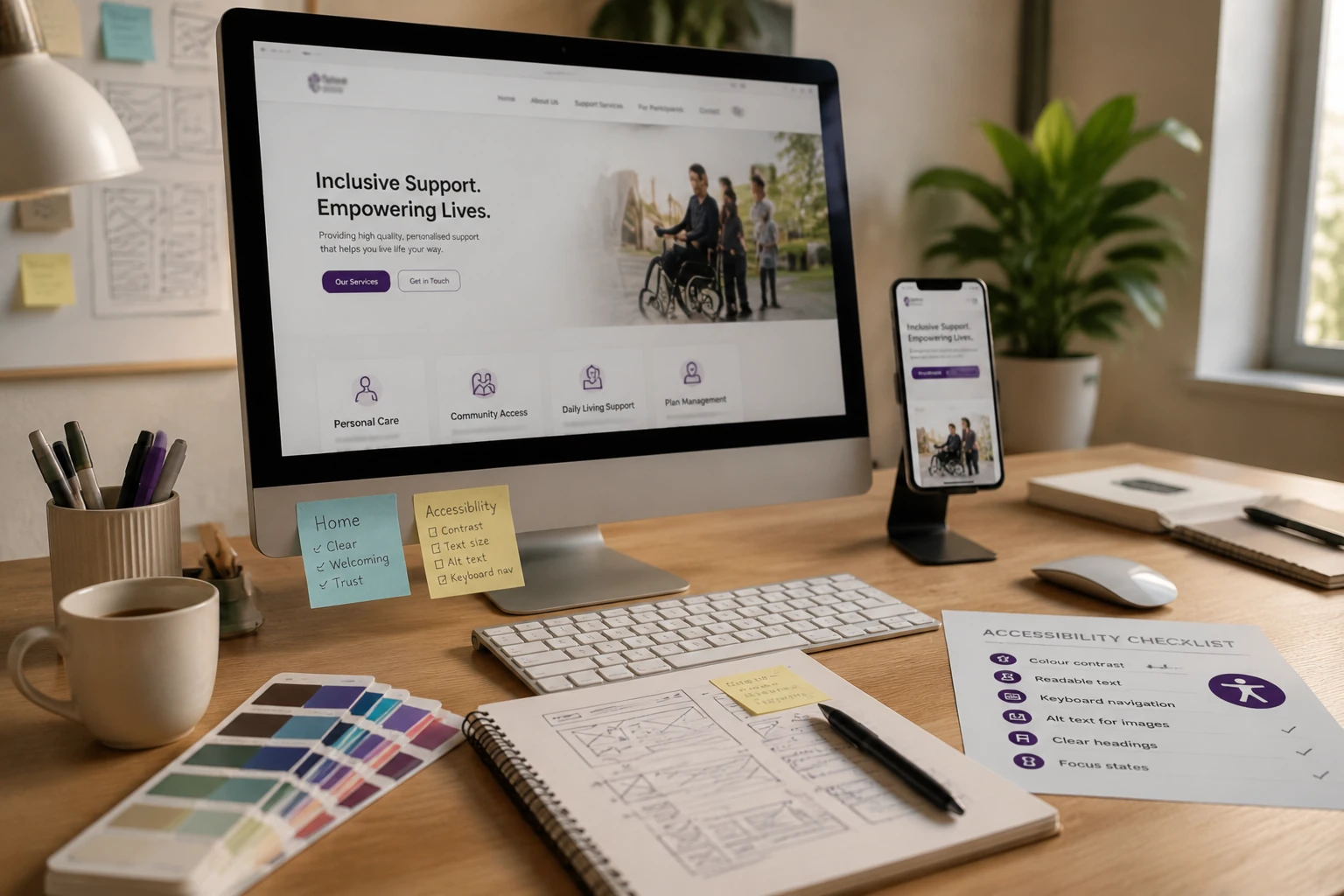
Picture a carer sitting up late, trying to find the right support provider for someone they love. They land on your website, and within seconds, they’ve already started forming an impression of your organisation. And they want only one thing: proof that you can help the person they’re worried about.
But many National Disability Insurance Scheme (NDIS) provider websites fail to do this. They cram service lists into dense paragraphs, use jargon like “psychosocial supports” without explaining it, or bury their contact details three clicks deep.
We put this guide together to help you build a site that actually works for the people visiting it. We’ll cover:
Ready to build a site your community can rely on? Let’s get into it.
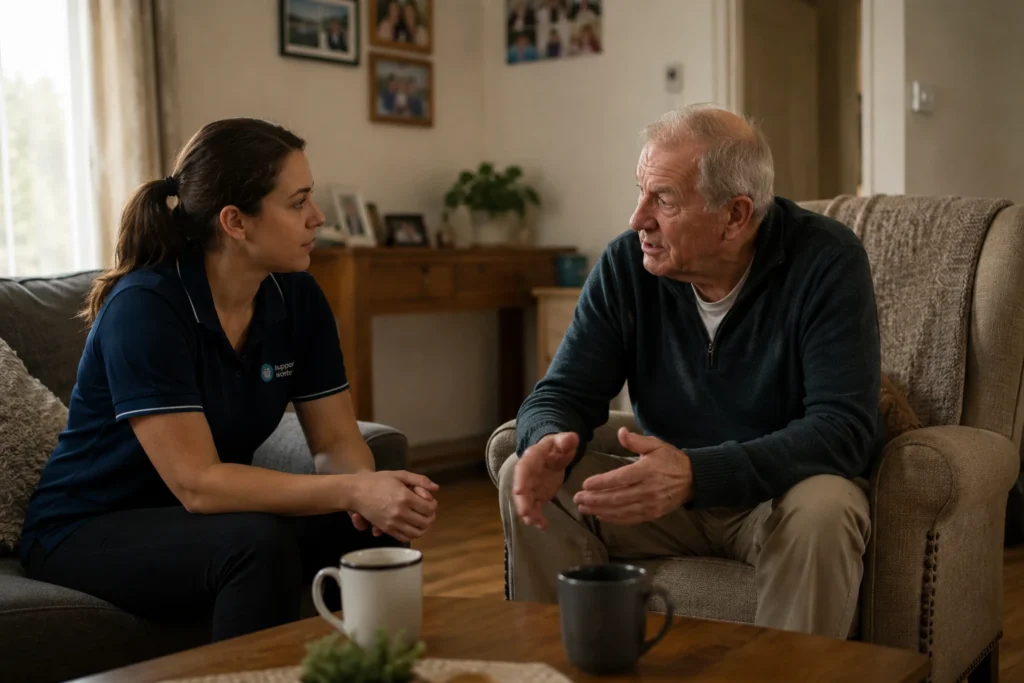
Web design for NDIS providers requires a different approach because visitors are making decisions about someone’s care rather than choosing between products or prices.
Think about a parent searching for in-home support for a non-verbal teenager or a carer researching options for an elderly parent with dementia. In situations like these, confidence drives the decision. Visitors want to know that your organisation understands their circumstances and can provide the support they’re searching for.
That’s why the most effective NDIS provider websites focus on earning that trust from the moment a visitor lands on the page. Clear information, accessible design, and a trustworthy user experience all play a role in helping people feel comfortable taking the next step.
Accessibility is one of the most misunderstood parts of NDIS website design. Most providers assume it means large text and high-contrast colours, but it runs much deeper than that. Every structural and visual decision you make affects whether your site is genuinely usable by everyone who visits it.
Here’s what accessibility covers in practice:
Meeting these compliance requirements protects your organisation, but more importantly, it makes your site work for the people it’s supposed to serve. We’ve worked with providers who added accessibility after launch. The fixes took far more developer hours than getting it right from the start would have.

Your website builds trust through clear communication, approachable design, and simple contact options. Below, we cover each one in detail.
Vague service descriptions create doubt. A line like “we provide tailored support solutions” tells a carer nothing about what happens during a visit. Compare that to “our support workers help with daily tasks like meal prep and medication reminders, and transport to appointments.” It’s clear which one answers the question a worried carer is actually asking.
That specificity needs to run through your whole site. If you offer support coordination, describe what a first session looks like. Clear details help visitors understand what to expect and feel more confident taking the next step. Without them, every extra click becomes another barrier that may push them to look elsewhere.
Good website design signals whether your organisation feels welcoming before a visitor reads a single word. Warm photography, approachable typography, and a layout that avoids anything clinical all help create that first impression.
For someone looking for disability support, those visual cues can make your organisation feel more approachable and easier to trust. Think of it like the difference between walking into a community centre and walking into a government office. The environment shapes your expectations before anyone speaks.
Not every provider gets this right, though. A cluttered layout or cold stock imagery sends the opposite signal. And most visitors won’t stay long enough to find out if your services are the right fit.
NDIS participants, support coordinators, and carers researching referral pathways need a quick way to get in touch. When someone is looking for support, a complicated contact process creates an unnecessary barrier. A visible phone number, a short enquiry form, and a clear response time remove that barrier entirely.
For providers searching “how to design a good web page” for a disability audience, these three elements are a good place to start.
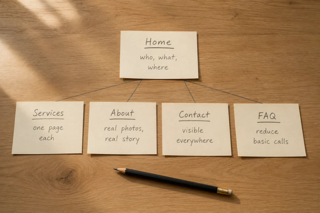
If you want your site to work for the people visiting it, the first place to start is your pages. That doesn’t mean you have to build all of them at once. Just the right ones will do, starting with these:
When these pages work together with a clear structure, your site stops feeling like a brochure and starts doing work for your organisation. We worked with three NDIS providers last year who restructured their sites along these lines. All three saw enquiries increase by around 10% within the first 90 days.
Once you’ve created these core pages, you might also be wondering “what is a sitemap in web design” and whether it’s worth having one. The answer is yes. A sitemap helps search engines find and index your pages, making it easier for your website to appear in search results.
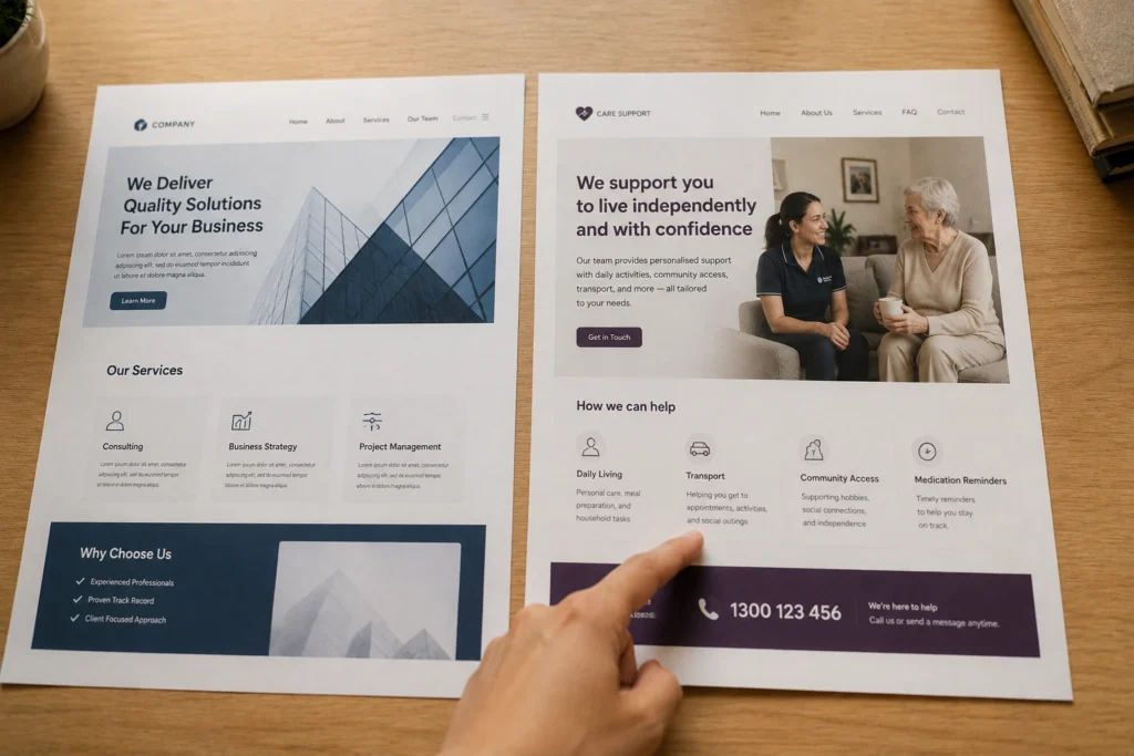
Many providers assume any web design agency can build a site that works for their audience. Technically, that’s true. But there’s a difference between building a website and building one for a vulnerable audience.
Take an agency that specialises in web design for small businesses. They’ll nail the structure, the branding, and the contact page. What they won’t get is the tone, the language, or the trust signals an NDIS audience needs before they’ll pick up the phone.
That difference influences more than the look of your website. It affects:
The result is a website that feels familiar to the people using it. And that familiarity makes it easier for potential clients to find the information they need and take the next step with confidence.
You now know that building an NDIS website that works comes down to two things: accessibility and trust. Get both right, and your site becomes one of your most reliable sources of new enquiries.
DevelopersDex builds NDIS websites around exactly that combination. Our team handles the accessibility standards, the trust signals, and the specific language your audience needs to hear.
Get in touch, and we’ll build a site your participants can actually use and trust.
Providers often have questions about the technical side of building an NDIS website. We’ll answer some of the most frequently asked ones below.
A sitemap is a file that lists every page on your site and shows how they connect. Search engines use it to find and index your content. That makes it easier for your NDIS provider website to show up in relevant search results. Most website platforms generate one automatically, but it’s worth checking that yours is set up correctly.
A good web page has a clear purpose, a logical structure, and content that answers the visitor’s question without making them work for it. For NDIS provider websites, that also means accessible design, plain language, and a visible next step on every page.
Together, these elements make it easier for visitors to find the information they need and feel confident about getting in touch.
Yes. NDIS provider websites should be designed in line with recognised accessibility standards.
After all, compliance helps make your website accessible to people with disabilities while reducing potential legal and reputational risks. It also ensures participants, carers, and support coordinators can access information regardless of how they browse the web.
Company Reviews