

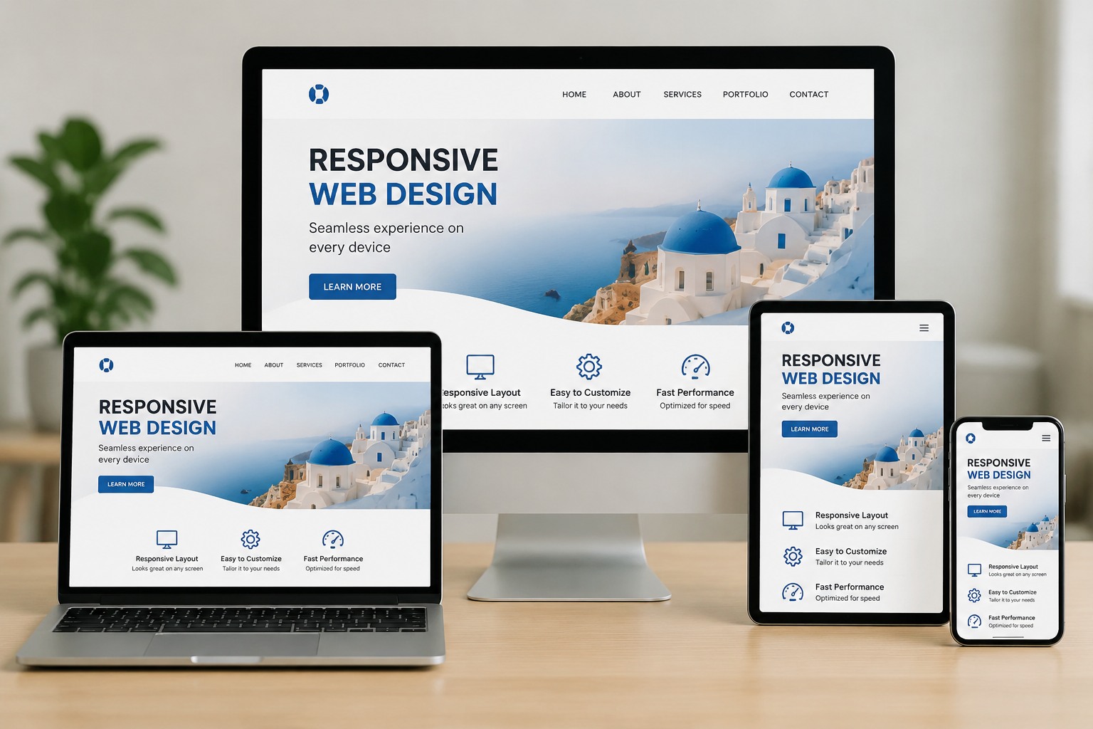
Most Brisbane business owners don’t realise their website looks broken on mobile until a customer tells them. By that point, the damage is already done. Visitors have bounced, enquiries haven’t come in, and Google has quietly pushed the site further down the rankings.
The frustrating part is that your desktop version looks completely fine. So the problem goes unnoticed for months.
This is what poorly responsive web design does to a business. And unfortunately, it happens more often than most web designers would like to admit.
So what does responsive mean in web design, and why does it affect your business more than you’d expect? This article covers what responsive web design actually is, how it differs from a basic mobile-friendly site, and what a solid responsive website design looks like in practice.
Responsive web design is an approach where a website’s layout automatically adjusts to fit the viewer’s screen. Open your site on a desktop monitor, a tablet, or a mobile phone, and the content rearranges itself. As a result, content stays readable and easy to use across every screen size, without any horizontal scrolling or broken layouts.
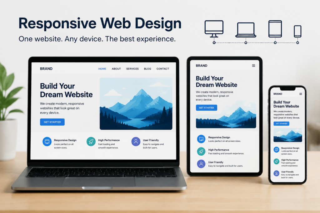
Before responsive web design became the standard, most sites were built with fixed pixel widths. That meant web pages render well on a 1024px desktop screen but fall apart completely on anything smaller. Because of this, web developers had to build separate mobile versions of the same site, which was time-consuming and produced inconsistent results across devices.
Responsive design solved this problem by making web pages adapt automatically. It’s built on three core pillars that work together:
Together, these three elements are what give a website basic responsiveness. Most modern websites use all of them, and for good reason. When a website includes responsive behaviour from the start, web pages render correctly on every device, without creating a separate version for each one.
Think of it this way: a flexible grid layout is the skeleton, fluid images are the skin, and CSS media queries are the instructions that tell everything how to move. Get one of them wrong, and the whole thing falls apart the moment someone opens your site on a smaller screen.
According to StatCounter, mobile devices now account for 64.35% of all global web traffic as of July 2025. For Brisbane businesses, those numbers make the distinction between a responsive site and a mobile-friendly one genuinely worth understanding.
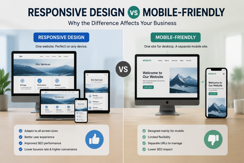
Most people use these terms interchangeably. However, they refer to two very different things. Here’s a simple breakdown of how they compare:
| Mobile-Friendly | Responsive Design | |
| How it works | Shrinks the desktop layout down to fit smaller screens | Rebuilds the layout to fit any screen size naturally |
| User experience | Often clunky, requires pinching and zooming | Clean and intentional on every device |
| Google ranking | Limited benefit under mobile-first indexing | Favoured by search engines |
| Flexibility | Fixed, works on common screen sizes only | Adapts fluidly to any browser window width |
| Long-term value | Gets you by | Gets you found |
This gap becomes obvious the moment a visitor lands on your site from a mobile phone. On a mobile-friendly site, text gets resized, and columns stack awkwardly. In turn, mobile users end up pinching and zooming just to tap a button, which drives them away before they even read your offer.
Believe it or not, a responsive site rebuilds that layout entirely. Responsive design adapts the structure so that the content fits naturally on any user’s device. The experience feels considered on every screen, not like a shrunken desktop version that barely made it through.
It’s also worth understanding adaptive design. Responsive and adaptive design are related but distinct approaches. Adaptive design uses fixed layouts built for specific screen sizes, switching between them based on the device detected.
Unlike responsive design, it doesn’t fluidly adjust to every possible screen width, so it can miss the mark on less common devices or when a user resizes their browser window.
Here’s where it connects directly to your Google ranking. Search engines, including Google, now index the mobile version of your site first. That’s called mobile-first indexing.
As a result, a mobile-optimised, fully responsive website design performs better in search results than a site relying on a static desktop version alone. With multiple devices in every household, a site built for one screen size will consistently lose ground to competitors with responsive websites.
A well-built responsive website holds its layout, loads fast, and keeps visitors reading regardless of the device they’re on. That outcome doesn’t happen by accident. It comes from a specific set of design elements working together from the ground up.
Here are the core building blocks web designers put in place to create responsive websites that work across all screen sizes and operating systems:
Most modern websites use a flexible grid layout that relies on relative units like percentages rather than fixed pixel values. Columns and rows resize based on screen width, so the structure adapts fluidly across different screens. This is the foundation of any responsive layout, and web developers typically set it up before anything else gets designed or coded.
Fluid images scale within their containers using the max-width property, preventing them from overflowing on smaller screens. Responsive images also load at the right size for each device, which directly improves page speed and user experience across mobile devices and desktops alike.
In fact, oversized images are one of the most common reasons responsive pages slow down on mobile. We see this problem regularly on Brisbane websites that were built without proper image optimisation in mind.
CSS media queries tell the browser how to rearrange the layout based on screen size. Web designers add multiple media queries to cover each breakpoint, from wide desktop displays down to narrow mobile phone screens.
Responsive typography adjusts font size within those breakpoints, too, so text stays readable at every viewport width without the user having to zoom in.
The viewport meta tag is a small but important piece of code placed in a website’s header. It instructs the browser window to match the screen width of the user’s device, preventing the site from rendering at desktop scale on a mobile screen. Without it, even a fully responsive design displays incorrectly on a mobile phone, which is a surprisingly easy detail to miss during a basic build.
Now, responsive design doesn’t operate in isolation. Knowing how to design a good web page also involves thinking about structure and content hierarchy before a single line of code gets written. Understanding what a sitemap in web design is connects directly to this.
A sitemap maps out every page and its relationship to others, which gives web designers a clear content structure to build the responsive layout around. Get the sitemap right, and the responsive design has a logical foundation to work from.
Together, these building blocks are what separate a responsive site that genuinely performs from one that only looks the part on a desktop screen.
Now that the building blocks are clear, the next step is understanding what separates a responsive website that converts from one that simply passes a mobile check.
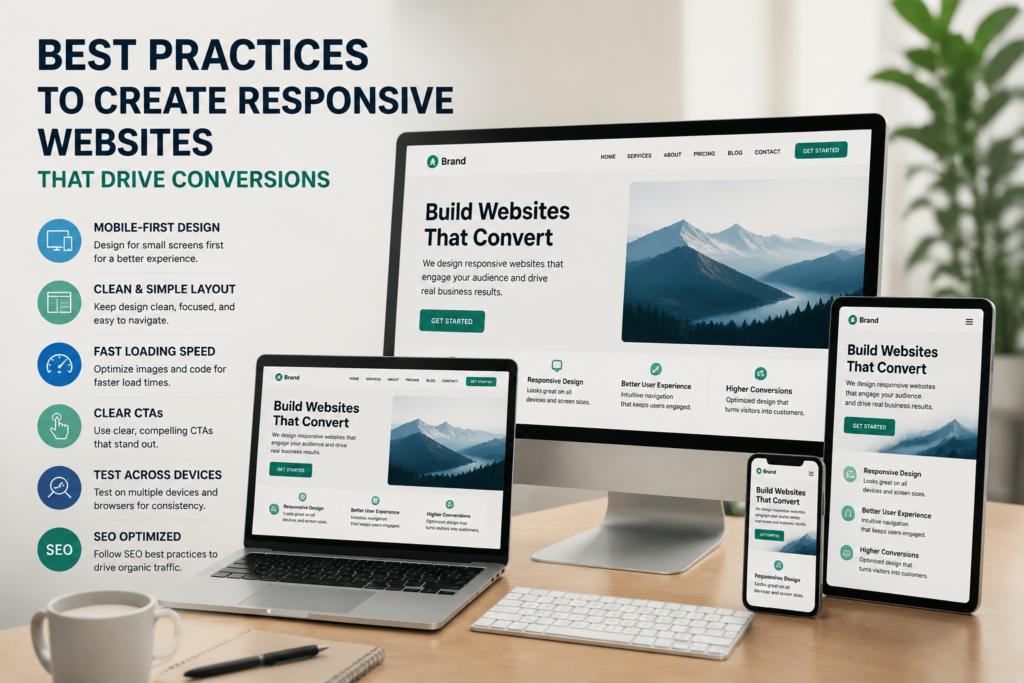
These best practices are what good web designers apply when building responsive websites that perform across different screens and devices:
Mobile-first design means building for the smallest screen first, then scaling up for larger devices. This approach forces web designers to prioritise the most important content and user interface elements before adding complexity for wider screens.
The result is a leaner, faster, responsive page that already works well where most users interact with it.
Responsive images and fluid images need to load at the right size for each device. To get that right, using modern formats like WebP reduces file size without sacrificing quality, which directly improves load speed across mobile devices.
On top of that, web development best practices recommend setting responsive images with the srcset attribute. This tells the browser to serve the most appropriately sized image based on screen size. Long story short, slow-loading images are one of the fastest ways to lose a mobile user before they’ve read a single word.
Media queries define the points at which a responsive layout shifts to suit a different browser window width. That’s why good web designers set breakpoints based on where the content actually starts to break, not by copying them from a framework.
This data-driven approach produces a more natural responsive behaviour across all screen sizes, from a wide desktop layout down to a narrow mobile phone display.
Usability testing on real devices catches layout breaks that desktop-only testing consistently misses. For instance, a responsive site might look perfect in Chrome on a MacBook but display incorrectly in Safari on an iPhone.
With that in mind, web designers use tools like Chrome DevTools to simulate different screens during the build. Even so, testing on actual mobile devices and across multiple operating systems is the only way to confirm the responsive website design holds up in the real world.
We’ve seen enough post-launch surprises to know that skipping this step always ends up costing more to fix later.
Creating responsive websites that genuinely convert takes more than ticking a mobile-friendly box. It requires 3 things done properly:
For Brisbane businesses looking to create responsive websites that rank, perform, and grow, working with an experienced web design team removes the guesswork entirely.
Our web designers at DevelopersDex build responsive WordPress websites around your business goals, from single landing pages through to full e-commerce builds. Responsive web design examples from our work cover a range of industries and budgets, so there’s a starting point for every business.
Responsive web design decides whether your website works for the people visiting it, on the device they’re actually using. For Brisbane businesses, that’s no longer optional.
A properly built responsive site gives your business a real presence across every screen. Search engines reward it, and users expect it.
At DevelopersDex, we build responsive WordPress websites for Brisbane businesses across all budgets and page types. If your current site isn’t performing on mobile devices, get in touch with our web design team today.
Company Reviews