
A restaurant website works when it does one thing well: moves someone from “I’m hungry” to “I’ve made a booking” without friction. That means a fast-loading menu, a clear path to reserve a table, and photos that make the food worth leaving the couch for.
But many restaurant websites focus on looking impressive rather than getting the basics right. A flashy design won’t help if diners can’t find the menu, book a table, or order from their phones. If another restaurant makes those things easier, that’s where they’ll go.
This guide covers the essentials of a restaurant website, including a menu that’s easy to use, simple online ordering, and a smooth mobile experience. You’ll also learn how small details can make diners more likely to come back the next time they’re deciding where to eat.
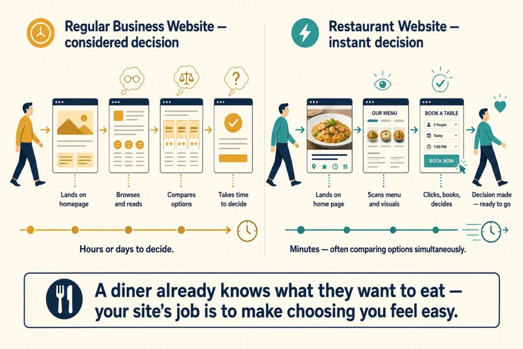
Unlike many business websites, a modern restaurant site needs to quickly show diners why that particular restaurant suits what they’re looking for. When someone searches for “cheeseburger”, they already know what they want to eat. If your site doesn’t make the food appealing or the key details easy to find, there will be little to keep them there.
A Square survey found that 45% of U.S., Canada, UK, and Australia diners said a restaurant website would inspire them to try somewhere new. That makes the basics important. Diners need to see what you serve, know what to expect and find information they need without digging through the site.
The menu is one of the first things people look for, so it needs to be quick to open and easy to scan. But many restaurant sites still use PDF menus.
There’s nothing inherently wrong with PDFs, but they aren’t always the best format for a restaurant website. They can be slower to load and awkward to read on mobile, especially when someone has to pinch and zoom just to check a price.
A better option is to build the menu as a proper HTML page. It can adapt to any screen size, load within the site itself, and let diners scan dishes and prices without opening a separate file.
Once it’s built as a web page, the menu should:
Easy updates also help keep prices and dishes accurate. If someone spots an outdated price, they may start wondering what else on the menu is wrong.
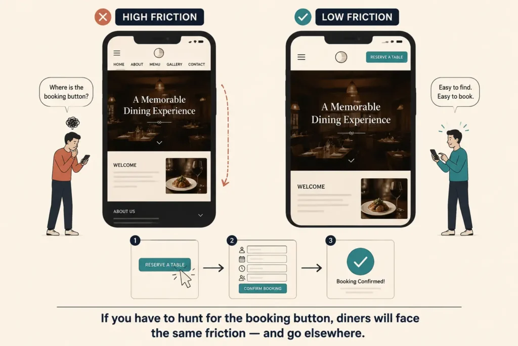
A booking or ordering system only works if diners can find it and complete the process with minimal friction. You might think “duh.” But what looks okay to you might not to your visitor. The booking button might be buried in the navigation, or the form might ask for too much information.
This is different from web design for tradies, where a visitor may fill in a quote form and wait for a response. Restaurant bookings are often made in the moment, with customers comparing options as they decide where to eat.
Put the booking button in the header so it’s visible on every page. Then look at what happens after the diner clicks it. Are they taken to a booking page that feels like part of your website, or sent somewhere completely different? If it’s the latter, use a booking platform like OpenTable that keeps the process simple and consistent with the rest of your site.
Before the site goes live, test the whole process on a phone. Try booking a table from start to finish. If you have to hunt for the button or fill in unnecessary fields, diners will face the same friction.
67% of people use mobile most often when searching for restaurant and dining information. If your site isn’t optimised for phones, many diners will struggle to find what they need.
Yet we see many businesses put most of their attention on the desktop version and treat mobile as something to tidy up afterwards. Desktop still needs to work well, but mobile deserves equal attention, if not more. Buttons should be easy to tap, and text should be readable without zooming. Your menu, booking page, and location should also be easy to find.
Consider web design for real estate agents, for example. A buyer might spend time browsing floor plans, comparing properties, and looking through image galleries. A diner is usually making a much quicker decision. They want to check the menu, see where the restaurant is, or book a table without fighting the site.
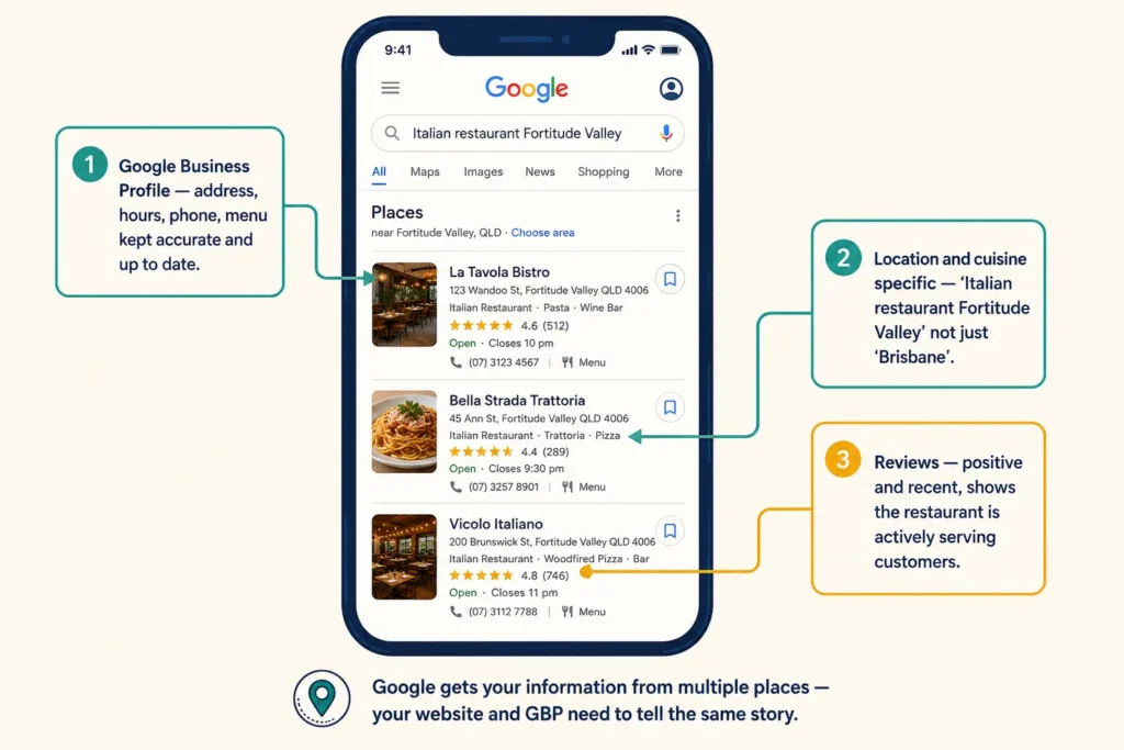
Say you’re looking for “Italian restaurant near me” after work. Google will show you restaurants it thinks are relevant to your search and location. But there’s a catch. The information Google has about your restaurant needs to be accurate and complete if you want diners to find the right details.
So how does Google get that information? Your Google Business Profile is one of the main places it comes from. Keep your address, opening hours, phone number, menu and other key details accurate and up to date.
Your website can reinforce that local relevance too. If your cafe is in Fortitude Valley, say so on the site rather than relying on a broad “Brisbane” location. The same applies to cuisine. A diner searching for Italian food in Fortitude Valley should be able to tell from your site that you serve Italian food there.
Reviews add another layer of reassurance. A good number of positive reviews can make diners more comfortable choosing your restaurant, while recent feedback shows that you’re still serving customers today.
Food photography plays a major role in whether a diner stays on your website or moves on. Think about the last time you saw a photo of a perfectly roasted chicken, a juicy burger, or a slice of cake and thought, “I’m hungry.” That reaction is exactly what restaurant photography should create.
The goal is to make the food look worth going out for. Keep these points in mind:
Restaurant photography also shouldn’t follow the same approach as web design for photographers. Their images are the work being presented, so the images themselves are the product. A restaurant website has a different job. Its photos need to make the food appealing while still loading quickly.
Then consider the rest of the design. A fine dining venue might use elegant fonts, muted colours and plenty of white space. A casual brunch spot, by contrast, might suit brighter colours, bolder type and a more relaxed layout. These choices should match the experience diners can expect when they walk through the door.
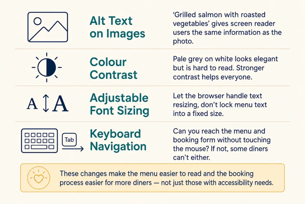
An accessible restaurant website doesn’t make diners work around the site. Someone using a screen reader should understand the menu, while keyboard users should reach the booking form without getting stuck. Here are a few ways to make that happen:
Together, these changes make the menu easier to read, the booking process easier to use, and the whole site less frustrating for more diners.
Getting a diner to visit once is only half the job. Your website should give them a reason to think of you the next time they’re deciding where to eat.
An email signup at checkout gives you a direct way to stay in touch. You can use it to announce seasonal menus, special events or other reasons to come back. A simple loyalty programme can work alongside it, even if it’s just a digital version of the old-fashioned stamp card.
You can also use the website to learn what brings diners back. Ask how their meal was, what they enjoyed or what could have been better. Then use those responses to guide future offers and updates. The more useful those updates are, the more reason consumers have to check the site again.
A restaurant website that loads fast, reads clearly on mobile, and makes booking easy gives diners fewer reasons to leave. More importantly, it should make choosing your restaurant feel easy every time they decide where to eat.
If your current site isn’t doing that job, DevelopersDex can build one that is. We create websites for restaurants and other hospitality businesses around how diners actually browse, choose and book. Get in touch and let’s talk about what your restaurant needs from its website.
Company Reviews