

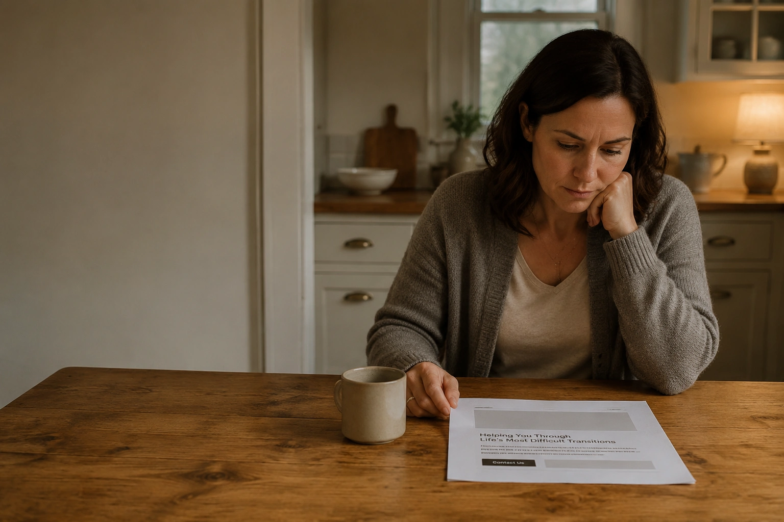
Your website is getting visitors. But your phone isn’t ringing with the right ones. Maybe you’re fielding calls from people who can’t afford your fees, or chasing enquiries that go nowhere. Or you’re just not getting enough contacts at all, and you’re not sure why. Either way, your website is supposed to be working for you, and right now, it isn’t.
That’s the problem most family law firms don’t realise they have. Their website looks professional and includes all the standard features you’d expect. But it wasn’t built to convert, and there’s a difference between a website that exists and one that turns visitors into paying clients.
Conversion-focused web design for family lawyers addresses exactly that gap. In this guide, we’ll show you how design decisions affect the number and quality of enquiries your website generates. You’ll also learn why a visually impressive site can still underperform if it isn’t built to convert.

In plain terms, conversion-focused web design means your website is built with one job in mind: getting the right people to contact your firm. Everything on the site is built to support that goal, right down to the calls to action and contact forms.
Think of it like a good receptionist. When someone walks in stressed and looking for help, a good receptionist doesn’t recite the firm’s history. They read the room, say the right thing, and make it easy for that person to take the next step.
A conversion-focused website does the same thing, just at scale and around the clock. It guides visitors toward action instead of leaving them to figure it out.
That’s even more important in family law. People searching for help with divorce, custody, or financial settlements are rarely browsing out of curiosity. They arrive with a problem and want to know, quickly, whether your firm understands their situation and how to get started.
A well-designed website gives them that confidence and makes the next step obvious.
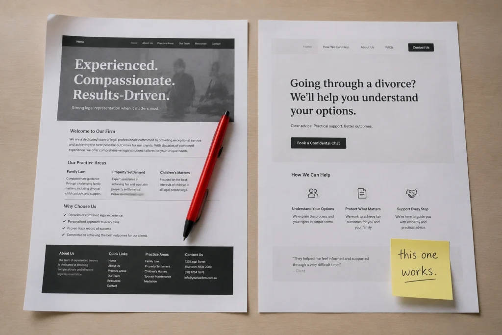
The honest answer is that most law firm websites are built to impress other lawyers, rather than speak to the people searching for help. They lead with the firm’s history, list every area of practice, and bury the contact form at the bottom. That might feel thorough, but to someone going through a divorce or a custody dispute, it feels cold and overwhelming.
Two issues in particular prevent many law firms from fixing this.
Most people searching for legal help are on their phones, sometimes late at night or sitting in their car looking for a moment of privacy. In fact, mobile devices account for over 65% of all web traffic worldwide.
When your website is slow, most of those people leave before they’ve read a single word. And if your mobile layout is clunky or hard to navigate on a small screen, you’ve already lost them.
Slow load times also hurt your Google rankings directly, since page speed is a confirmed ranking factor. Slow load times and a broken mobile layout are especially damaging for family law firms because they directly affect conversions. The longer they go unfixed, the more potential clients you lose to a competitor whose site simply works better on a phone.
“Experienced. Compassionate. Results-driven” appears on most of the family law websites.
It says nothing, and prospects know it. When someone is searching for a family lawyer, they’re usually worried about the kids, finances, and what happens next. More than anything, they want to feel understood. Heavy marketing language creates distance when reassurance is what they need.
If your homepage leads with your firm instead of their situation, that distance is already there. High-converting family law websites do the opposite. They lead with the visitor’s problem, then show understanding before introducing the firm.

The best-performing family law websites do two things well. They make it easy for visitors to take action, and they remove the hesitation that stops people from reaching out. Below, we’ll look at both.
UX stands for user experience, basically how easy and intuitive it is to move through your website. On a well-designed family law site, visitors always know what to do next. Each page points them toward a single action, such as calling your office or requesting a consultation.
You should make it easy for them to take that next step. So your phone number needs to be visible without hunting for it. And once visitors decide to reach out, the contact form should be short, reassuring, and only ask for what you actually need.
The same principle applies to your calls to action. Small wording choices can change how comfortable people feel about reaching out. For example, a button that says “Get confidential advice” feels very different from one that simply says “Submit.”
And the numbers back it up. Believe it or not, personalised CTAs convert 202% better than generic ones. Even a one-line privacy note can make a difference. Something as simple as “We’ll never share your details” reassures people who may hesitate to share sensitive information.
Trust is the whole game in family law. Someone considering reaching out to your firm is about to share some of the most personal details of their life with a stranger. That’s a big ask. Your website needs to do the work of reducing that hesitation before they ever pick up the phone.
That means real photos of you and your team. Stock images of anonymous people in suits signal inauthenticity immediately. Testimonials are important too. The strongest ones mention specific situations and outcomes rather than vague praise about “great service.”
Clarity also helps people feel more comfortable reaching out. Stating your response time upfront, for example, reassures visitors that they won’t be left waiting in silence during an already stressful period. A simple promise such as “We aim to respond within two hours during business hours” can go a long way.
Your credentials are important as well, but they land better once trust is already established. Lead with empathy, then back it up with proof.
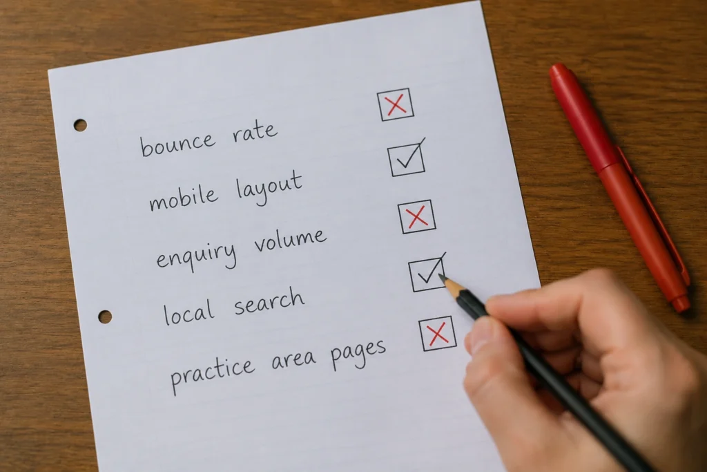
Before getting into the signs, it helps to have a benchmark. If you’ve ever wondered what a good website conversion rate is for a law firm, most well-optimised sites sit somewhere between 2% and 5%. So if a hundred people visit your site and fewer than two of them get in touch, something’s getting in the way.
These are the warning signs that tend to show up when a family law website isn’t pulling its weight:
If a few of these sound familiar, you don’t need to start from scratch. From what we’ve seen, focusing on mobile usability, page speed, and practice area content often delivers the quickest improvements in enquiry quality and conversions.
A family law website doesn’t need to be flashy. It needs to load quickly, look professional on any device, and make it obvious what you do and how someone can get in touch. Get those fundamentals right, and everything else becomes much easier. And if your site isn’t doing that right now, it’s worth finding out why before you spend another dollar on ads or SEO.
At DevelopersDex, we build websites for family lawyers across Brisbane with exactly that in mind. We offer a free consultation where we’ll review your current site and give you an honest assessment of what’s helping and what’s holding it back.
Visit our services page or get in touch with the team today to book your free review.
Company Reviews