

You’ve got traffic coming in. People are finding your site, clicking around, and maybe even spending a few minutes on it. But the enquiries aren’t coming, and you’re left wondering what’s going wrong.
The honest answer: it’s usually your design. That doesn’t necessarily mean your website looks bad. The problem is that looking good and converting are two completely different goals. Most sites are built for the first one, with little thought given to the second. That gap is exactly what conversion-focused web design is built to close.
In this guide, we’ll walk you through how it works and what a conversion-focused website looks like in practice. By the end, you’ll know what’s costing you leads and what a better-built site looks like.
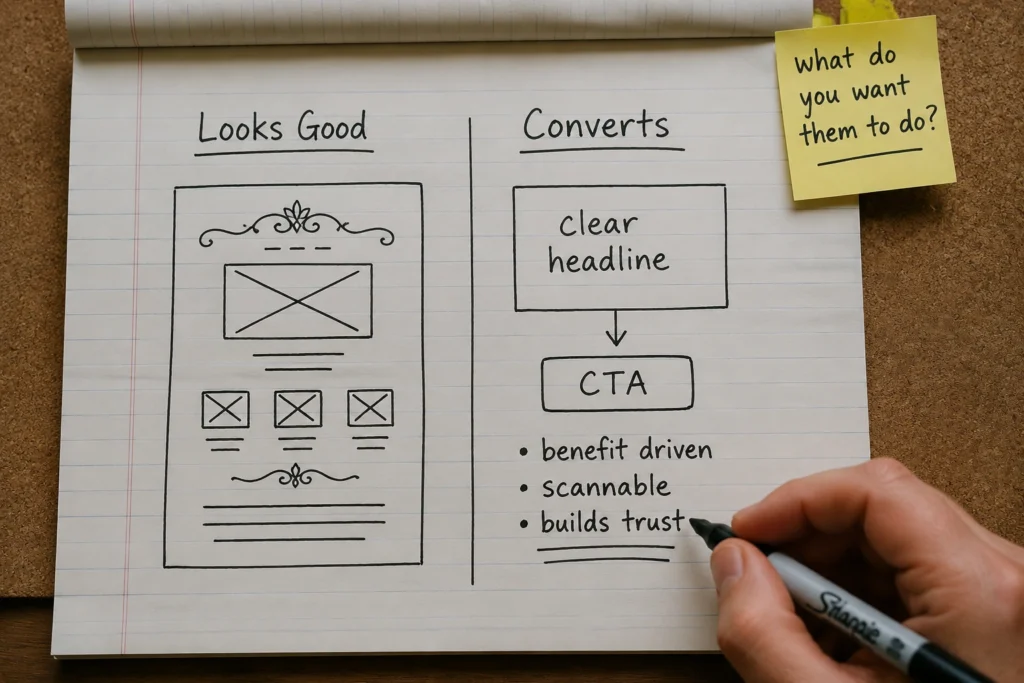
Conversion-focused web design is the practice of building a website around a single goal: getting visitors to take a desired action. That action might be calling your business, submitting an enquiry, or making a purchase.
However, most websites aren’t built this way. They’re designed to look professional and reflect the brand, which isn’t wrong. But looking polished and guiding your target audience toward a specific outcome are two different briefs.
Conversion-centred design starts with one question: what do you want visitors to do? Everything else follows from there.
Take a family law firm as an example. A stressed visitor lands on the site looking for answers. Conversion-focused web design for family lawyers makes it easy for that person to find the right information fast. From there, the design builds enough confidence for them to pick up the phone and call. That’s persuasive design doing its job.
It’s not about making your site purely functional or stripping out anything that looks good. Conversion-focused design can absolutely be beautiful. It just never lets aesthetics get in the way of clarity.
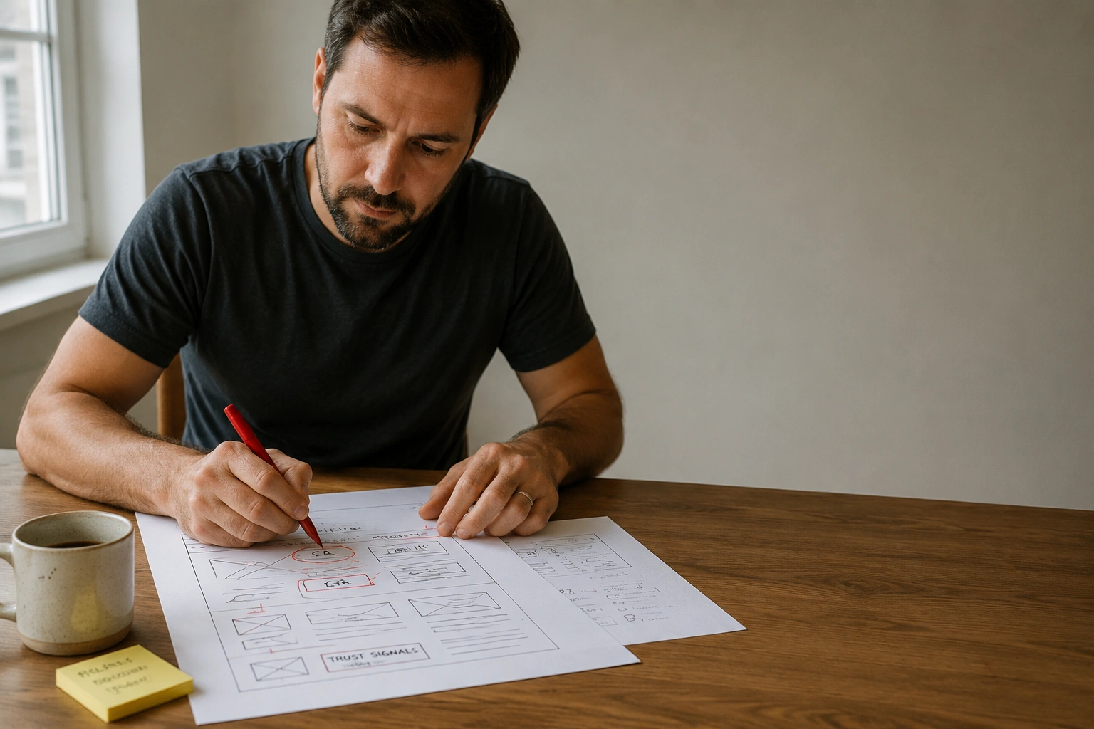
Most low-converting websites share three common problems: poor layout, weak calls to action, and missing trust signals. Below, we break down each one in more detail.
Think about the last time you walked into a well-organised shop. You knew where to look, what was on offer, and where to go next without anyone telling you. That’s visual hierarchy in action.
On a website, hierarchy is how you guide someone’s eyes from the moment they land. What they see first should tell them clearly what you do, who it’s for, and highlight the most important information instead of burying it three scrolls down.
When hierarchy is off, visitors don’t know where to focus. They scan, feel uncertain, and leave because the page gave them no clear reason to stay.

A call to action should make the next step obvious and give visitors a reason to take it. The problem is that many websites rely on generic, passive CTAs, and those do neither.
For example, “Learn more” doesn’t tell visitors what they’ll get, and a “Contact Us” buried in small grey text at the bottom of the page won’t motivate anyone.
Place your CTAs where people are naturally thinking, “Okay, what’s next?” That’s when they’re most likely to act.
Let’s say you run a bookkeeping service in Brisbane. You’ve helped dozens of small businesses and built a great reputation, but a visitor landing on your website for the first time has no way of knowing that.
Trust signals close that gap. Reviews, certifications, and client logos give visitors something to hold onto before they commit to picking up the phone. And they work because people tend to make decisions based on what others have done before them. A site without social proof asks visitors to trust blindly, and most won’t.
High-converting websites rely on above-the-fold messaging, clear calls to action, user behaviour and data-driven design, and fast, mobile-friendly pages. Let’s walk through each one.
Above-the-fold is the section visitors see first before they scroll. It’s the most valuable space on your site, and it often decides whether someone stays or leaves.
In those first few seconds, a visitor is asking three things: is this for me, can this help me, and do I trust it? Your above-the-fold section needs to answer all three quickly.
That means a clear headline explaining what you do, a subheading that adds context, and a strong call to action pointing to the next step. White space, visual hierarchy, and simple action-oriented language all help support that message.
A CTA’s effectiveness is not just about what it says. The design around it determines whether it is noticed at all.
Colour contrast plays a big role in that visibility. A button that blends into the page often gets ignored, while one with strong contrast naturally draws the eye.
Size and white space also influence how a CTA performs. A CTA with enough room feels intentional. Bury it in clutter, and it can easily get overlooked. In fact, we’ve seen conversion rates improve simply by giving a CTA more breathing room and placing it where visitors can see it sooner.
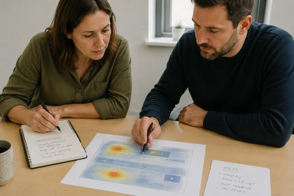
Most businesses redesign their websites based on opinions. One person thinks the homepage feels cluttered, another pushes for a new colour scheme. Gut feeling shapes the brief, and the result often looks different but performs about the same.
Data changes that. You can see exactly where visitors drop off, what they click, and what they ignore through session recordings and heatmaps. That shifts you from guessing to seeing what happens on the page.
That feedback loop is what keeps a site improving after launch. Small adjustments, based on real user behaviour, compound over time. A headline change here, a repositioned CTA there. Nothing dramatic, but each one is grounded in real data.
If your site loads slowly or breaks on a small screen, most visitors won’t wait around to see if it gets better. They’ll just leave. Over 65% of web traffic now comes from mobile devices, which means mobile performance can’t be an afterthought.
Slow page speed has the same effect. When a landing page takes too long to load, visitors often leave before they even see the content. Instead of engaging with your offer, they move on to a competitor who loads faster.
Fast load times, clean mobile navigation, and a layout that holds together on any screen size are what stop that from happening. They’re one of the most direct ways to increase website conversion rate without touching your copy or redesigning from scratch.
A lot of businesses treat SEO and web design as two separate projects. One team handles rankings, another handles the site. That gap causes problems.
Google’s ranking systems are increasingly tied to user experience signals like page speed, mobile performance, and how easily people can navigate a page. Poor performance in any of these areas affects your visibility in search results directly.
But rankings are only half of it. SEO brings visitors to your site. If the design doesn’t hold them once they’re there, all that effort is wasted.
Fast-loading pages, clear structure, and easy navigation improve both sides at once. They help search engines understand your content, and give visitors a clear path to taking action.

Not every agency that builds websites builds them to convert. Many focus on making sites look good, which isn’t wrong. But if lead generation and measurable business growth are what you’re after, the brief has to go deeper than aesthetics.
The right agency will ask about your business goals before talking about colours and layouts. They’ll want to know who your customers are, what action you want them to take, and what success looks like for your business.
So when you’re evaluating someone, a few questions will tell you a lot quickly:
An agency that can’t answer those confidently isn’t thinking beyond aesthetics. The goal isn’t a website that wins a design award, but one that consistently brings in enquiries and improves as you learn more about your visitors.
Every business with a website wants it to bring in work. The ones that do share something in common: a handful of deliberate design decisions made with the visitor in mind.
At DevelopersDex, we build WordPress websites with conversion and SEO performance baked in from the start. If your site is getting web traffic but not enquiries, get in touch, and we’ll take a look at what’s holding it back.
Company Reviews